Personalized fitness that encourages positive movement,
mobility and falling in love with the process of personal fitness.
The Challenge
The core challenge for the H2 Training website was translating Hunter Hames' personalized, one-on-one coaching philosophy into a professional, scalable online platform without losing the human element. The initial risk was that a "clean, professional" design could feel cold or impersonal, directly contradicting Hunter's dedicated, results-driven method.
The Solution
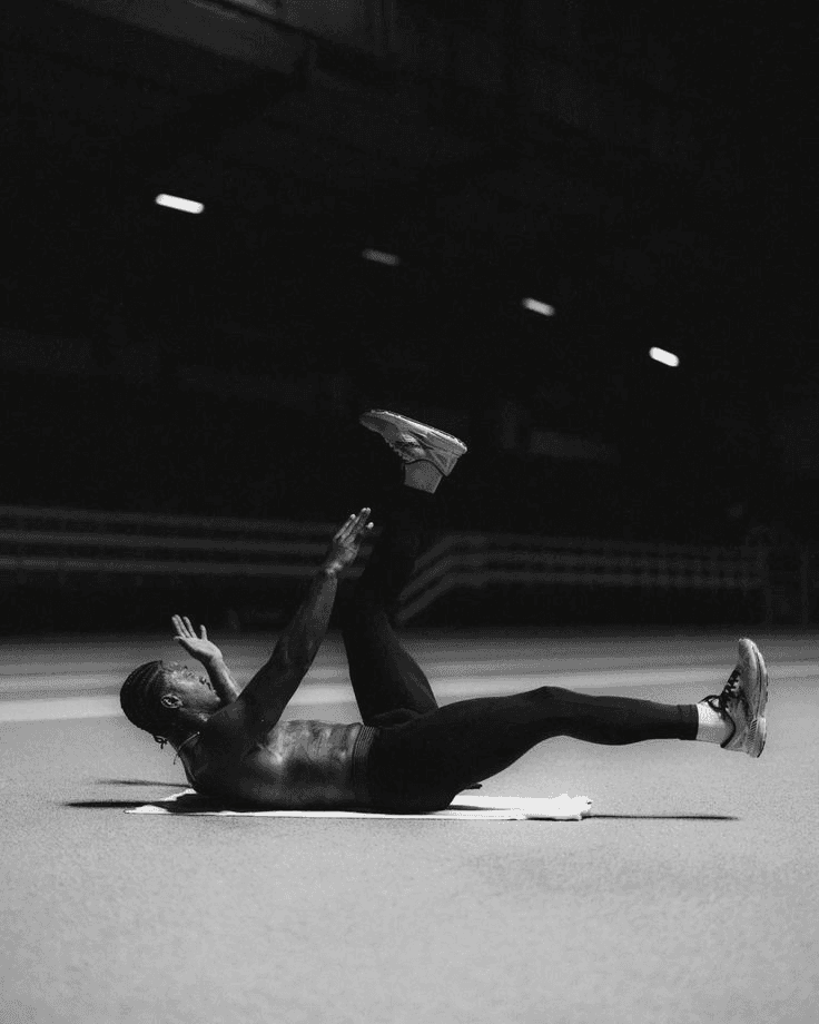
I employed a design strategy that emphasized high-quality, authentic photography of Hunter in action, paired with a minimalist color palette, and a streamlined, action-oriented user experience.

Logo Design


Color Palette
Typography
Primary Typeface
Aa
Manrope
A modern geometric sans font that conveys strength and clarity. Used for headlines, body text, and UI elements.
Secondary Typeface
Aa
Bebas Neue
A bold font that adds action and strength to help aspects of the brand stand out.
Digital Experience
A seamless mobile experience that guides users through account creation and personalization. The interface combines Athena's signature color palette with intuitive navigation, creating an engaging onboarding flow that reflects the brand's commitment to user-centered design.


Imagery & Vision
As an aspiring sports photographer, who specializes in women's athletics, the images behind this app were shot by me and inspired a space for women's sports to be prioritized.