The Challenge
Beyond needed a space to not only allow users to be able to easily access information about what they offer and how to book with them, but they wanted to elevate their brand to match their elite player development model. Developing a deeper sense of identity can help bring a global impact.
The Solution
Users of Beyond are deep lovers of the idea of process and development. Through these characteristics we were able to provide a brand that not only makes registration and sign ups easy, but creates an inclusive place for players of all stages to come and learn how to be a better player, leader and person.

Logo Design
Color Palette
Typography
Primary Typeface
Aa
Funnel Sans
A modern geometric sans font that conveys strength and clarity. Used for headlines, body text, and UI elements.
Secondary Typeface
Aa
Michroma
A bold font that adds action and strength to help aspects of the brand stand out.
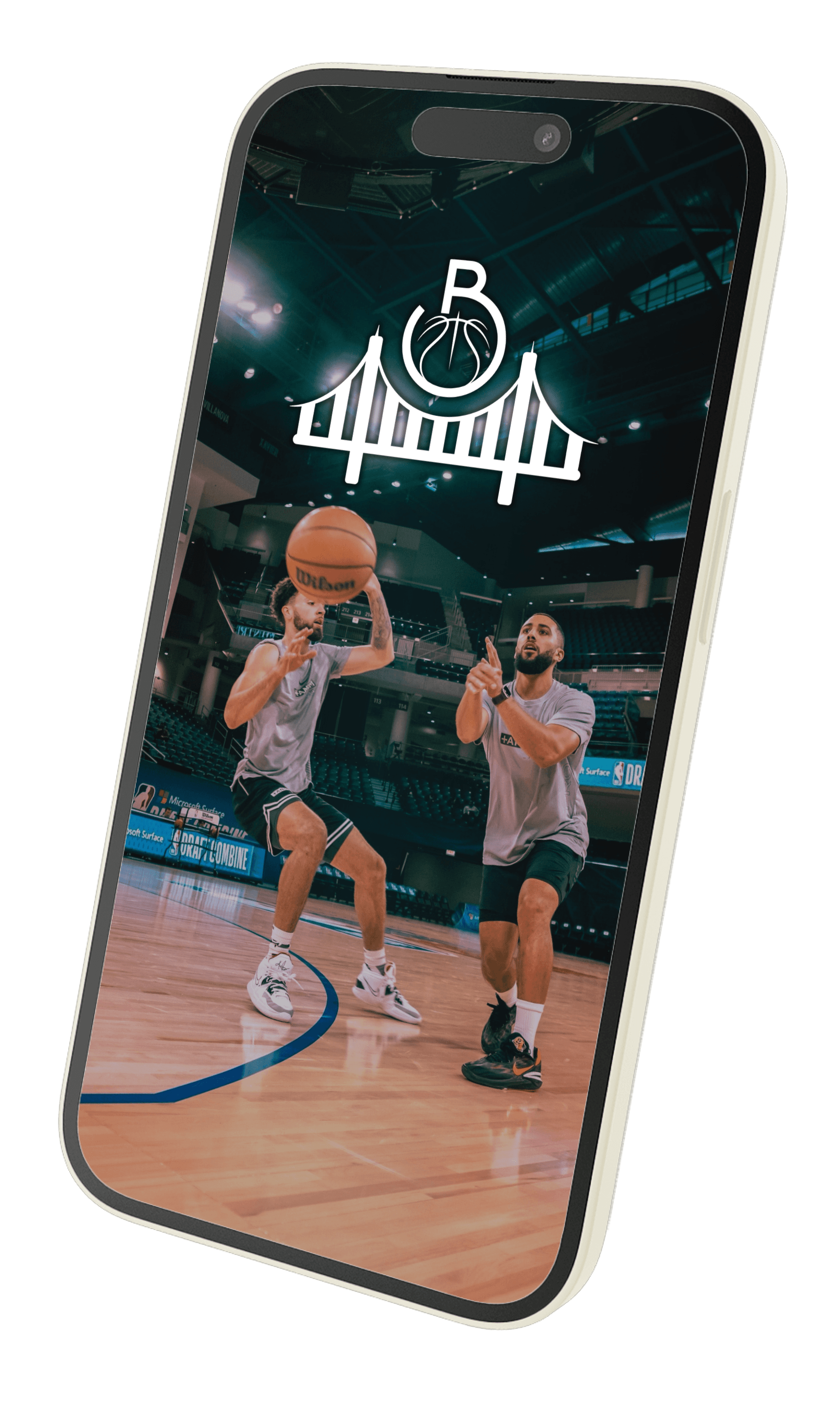
Digital Experience
A seamless mobile experience that guides users through account creation and personalization. The interface combines Athena's signature color palette with intuitive navigation, creating an engaging onboarding flow that reflects the brand's commitment to user-centered design.
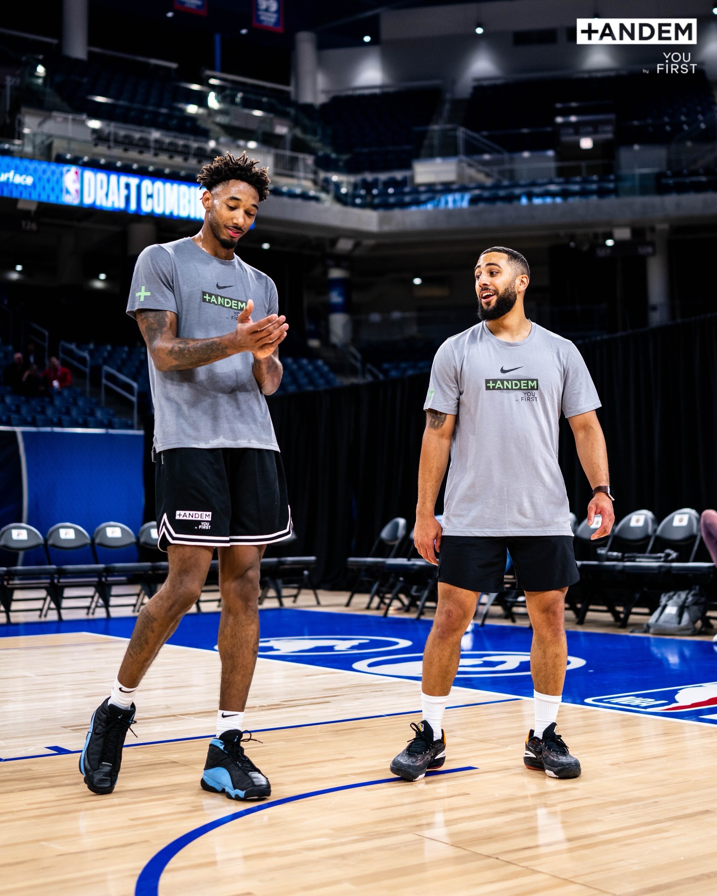
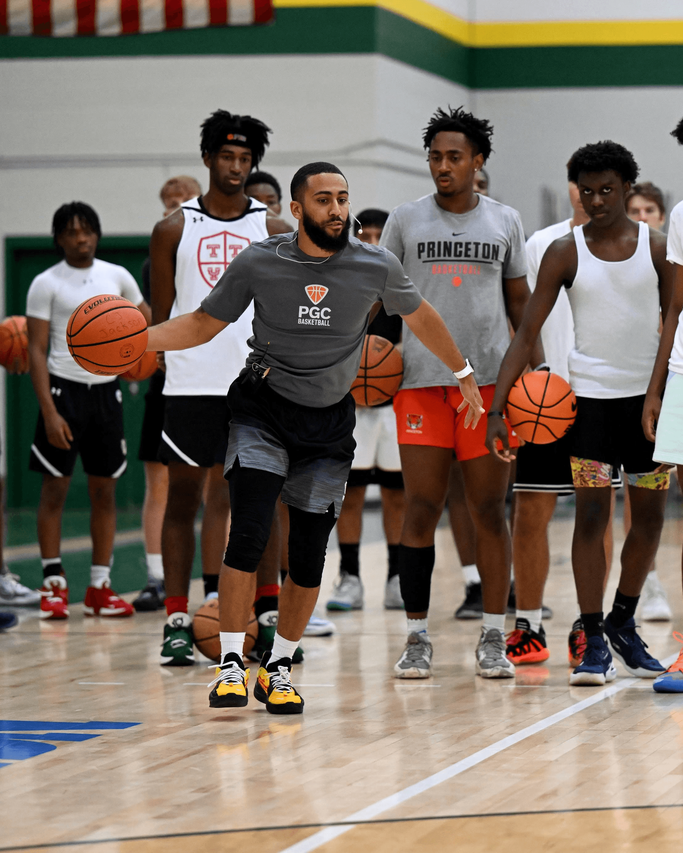
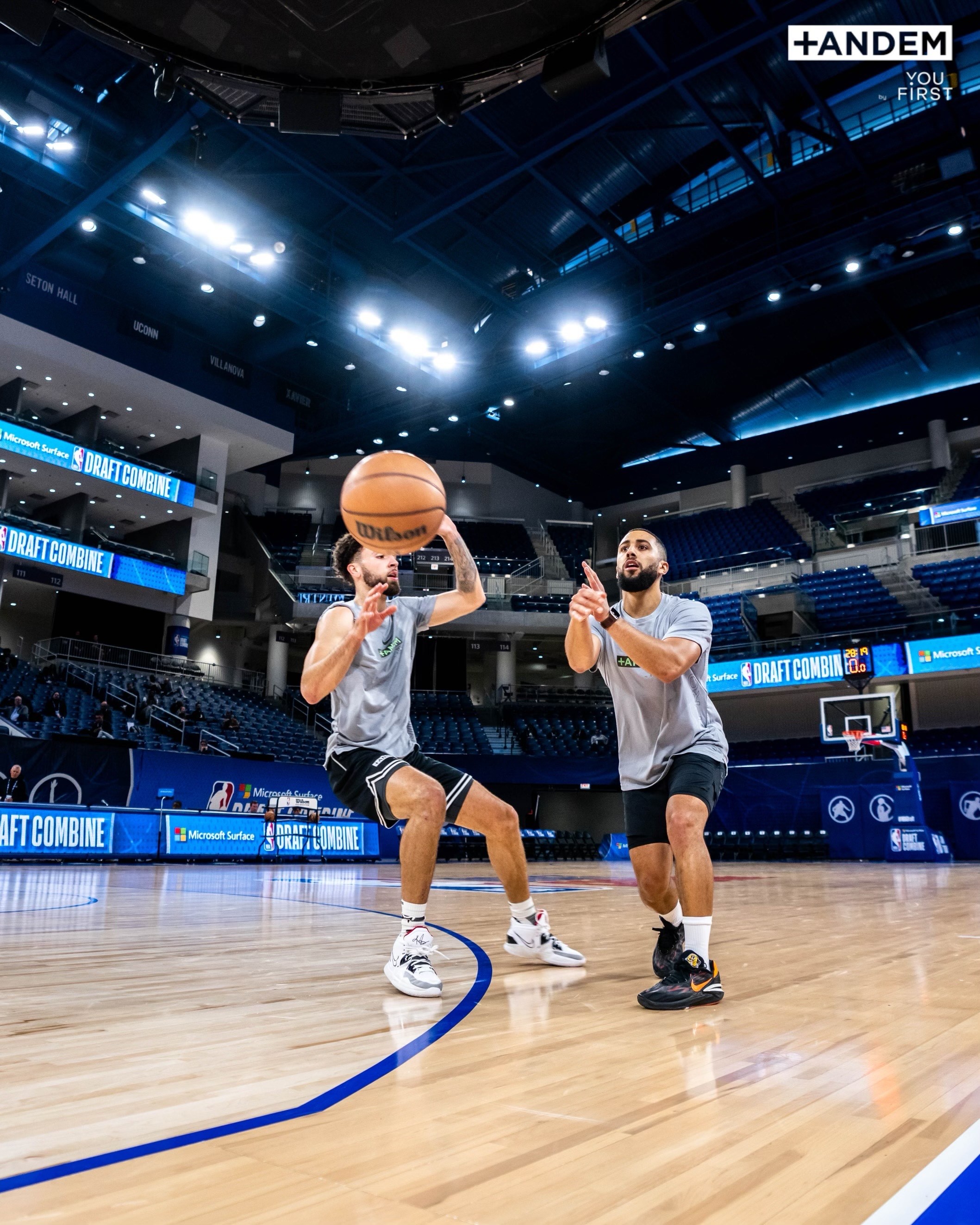
Imagery & Vision
As an aspiring sports photographer, who specializes in women's athletics, the images behind this app were shot by me and inspired a space for women's sports to be prioritized.